Marvel Logo Evolution: Why Did Marvel Logos Change
The Marvel Cinematic Universe Is One Big Giant Multiverse Now. Spiderman No Way Home brought back the iconic Tobie Maguire and the Amazing Spiderman Andrew Garfield. In doing so, the MCU now dates back to 2002, with Sam Raimi’s Spiderman being the canon.
Now, be it the classic Raimi’s Spiderman or the other Marvel blockbusters helmed by none other than Kevin Fiege, the Marvel logos keep changing in almost every movie. I’m sure you have noticed; wait, have you?
If not in every movie, they change the Marvel movie intro logo in every new phase of the MCU. The MCU currently carries the whole marvel comics industry on its shoulders. But, just as incredible Marvel’s movies are, the franchise is excellent at changing things for newer and more creative output.
With one fan service after another, marvel keeps breaking boundaries. The latest marvel logos are great, but some fans feel otherwise. While most fans like the current marvel logo, some fans still prefer the old ones over the current ones.
So, If your question is why did marvel change their Logo or why does marvel keep changing their Logo, I have some theories that may help you get an idea. But first, let me take you through a brief marvel logo history.
Marvel Logos Over The Year: History of Marvel Logos
Marvel Logos have faced several transitions over the years. With The Avengers logo, spiderman logo, and several other marvel heroes logos, the marvel is way past its time of becoming an icon. Here is a tiny timelapse of marvels logos over the years.
-
Marvel Logo 1993-1996
From Timely Comics to Atlas Comics, Marvel assumed different names over the years. With that, the Marvel Logo also changed several times. The first Logo of the marvel films included a metal-like substance for the background on which the Logo is curved. Across the second part of the Logo, the word “films” is written in red.
-
Marvel Logo 1996-2002
The Logo transitioned in 1996 with a yellowish effect on the word Marvel. The previous Marvel logo read Marvel films, while the new transitioned one replaced the word “films” with the word studios written the same way across the lower part of the Logo.
-
Marvel Logo 2002-2008
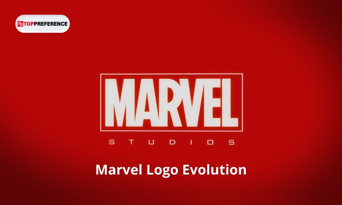
Marvel introduced the iconic red and white marvel logo in 2002. The Logo had a red rectangle with the word marvel written in white within.
This Logo continued from Sam Raimi’s Spiderman movies until the wake of the Marvel cinematic universe with Iron Man 2008.
-
Marvel Logo 2008-2013
The next marvel logo was a slight improvement over the previous one. The Logo included the same rectangular shape with the Marvel wording in the midst. However, the font this time is a little different. The thick wording had changed into a narrow sans-serif font, accompanied by “Studios” below. Marvel used this Logo in Iron Man 2008.
-
Marvel Logo 2013-2016
The Marvel comics logo changed once again in 2013. In this version, marvel separated the word studio from the main Scarlett red marvel logo badge. While the marvel part remains in the same color and background, the word studio has a white background with no framing. This is because the word studio was written in black. You can see this Logo in Thor: The Dark World.
-
Marvel Logo 2016-2022
In 2026 marvel introduced a new logo for the marvel cinematic universe. The word studio dramatically jumped beside the bold marvel wording, occupying almost the same font and size. The word Marvel Studios now stretches horizontally in a logo badge. Doctor Strange 2016 was the first movie to use the Logo.
While the word marvel still enjoys the red flare and stays on the left, the word studios have a sans-serif font with black letters and two bars above and below to contain them. The Logo looks stylish and professional and has appeared in all the marvel movies since 2016.
Why Does Marvel Change Logos?
There are many reasons why marvel changes or has changed the marvel logos over the years. Marvel movies have a huge emotional impact on us fans. The first comic book flipping marvel intro of Iron Man 2008 was a favorite of millions of fans.
The sound of the comic book flipping as it takes you deeper into the superhero world of marvel sure was amazing. But that marvel intro got replaced by a three-dimensional logo taking its place. Again, the Logo saw a shift with different MCU characters and a more horizontal marvel studios font.
Some of the possible reasons why marvel logos change are as follows-
Change In Management
Years Before, in 2009, Disney purchased Marvel entertainment, changing the Logo in the process. The Disney CEO Bob Iger removed marvel studios under the authority of Marvel Entertainment and put it alongside Pixar, Walt Disney animation, and Lucas Films. As a result, Marvel now is directly under Walt Disney Studios.
A change in management of the Marvel films often causes the change of Marvel logos.
To Invent Something New For The Fans
Marvel makes sure that their movies remain new and exciting each time. As a result, they keep experimenting with the marble superhero suits and the Marvel logos. A new logo for the new phase and movies gives something to look forward to.
Marvel Is Expanding
After Marvel finished their time travel flick in The Avengers: Endgame, Marvel started to experiment with alternate realities and the multiverse. The Idea of the multiverse boldly starts from Loki, the Disney plus series, and now is branching across different marvel stories. The same marvel logos may not work for all the marvel movies and series to come.
There was a time when fans had to wait for a year for anything related to marvel to come out. Now that we are way past Captain America Wielding the Mjolnir or Tony Stark saving the universe with his snap, Marvel has something ready for us each week. The expanding marvel series on Disney plus calls for new marvel logos and intros. As a result, the marvel logos are bound to change.
Excelsior!
The phase-wise change of Marvel logos may have upset a few fans. However, the majority of the fans believe that the Logo has only gotten better. The beautiful font on the scarlet red color looks premium with a metallic finish. In addition, most of the MCU fans are attached to the MCU iteration of the character. So, the way the characters appear in the new Logo sure is exciting to many fans.
After looking at several theories, I came across these points on why marvel logos change the way they do. If you have any other theories, you can share that in the comment.
Also Read:


