
From Data To Art: How Transforming Boring Stats With Piktochart Helps
Information can be valuable and beautiful, but only while you can present it in an organized manner. In this case, it is a luxury if you can quickly grasp the most important pieces of information about any topic in less than 30 seconds.
Yes! You are correct that it must be something that everyone can do more easily. Likewise, Piktochart is one of the best graphic designing tools, which would be beneficial in terms of transforming data into art.
One of the great ways to resolve the issue is by designing infographics, which will help explain the complicated data. But one major problem is that infographics sometimes turn into a messed-up thing.
Other wonderful colors lack design, making the information comprehensive and readable. Apart from that, a good infographic is always streamlined, simple, and easy to figure out. If you are not interested in using Piktochart, you can easily search for alternatives like Canva, Adobe Illustrator, and so many others.
What Are The Seven Steps To Transform Boring Data Into Interesting Infographics?

Let’s jump into things you must focus on to ensure your infographic looks readable, simple, and beautiful. Below, I will discuss the seven steps of transforming boring data into an interesting infographic.
1st Step: Pick The Interesting Topic
Firstly, you must start by selecting the content or subject you want to design your infographic around. In this case, you might have the next viral idea for your infographic. But this is also one of the good ideas which you can keep the audience’s mind. Aside from that, there are other evident benefits, such as while listening to your audience.
Therefore, you must cater your content to them. In this case, you must address their pain points and challenges. On the other hand, you must find out about the interests and other possible questions that are particularly industry-related. Alternatively, look at the industry trends and other search engine trends, or else you can pick the topic up from BuzzSumo as well.
2nd Step: Organize Your Industry Data
The second step is to organize your content and pick up the most relevant points, especially for your audience. If this is a blog post, you must dissect the primary structure of the industry topic and then pick the 4 to 5 key content elements.
If this is a data set, you must identify the top-notch 8 to 10 effect numbers that speak louder than other words. In this case, you must create charts and graphics to help you visualize your organization’s data.
Especially while you are transforming data to infographic, then you must pick the eight different sections such as:
- No Meetings
- Cutting Emails
- Wake Up Early
- Going Remote
- Focus, don’t multitask
- Use the exact software
- Do some things and so many others.
3rd Step: Design The Primary Structure
While you are designing the basic and the primary structure, the first thing you must do is grab a piece of pen and paper. After that, you must start creating the basic structure of your infographic. Also, don’t be afraid of making such mistakes that you couldn’t manage later.
Or else you will need to start from zero. Sometimes, you must take some steps to get that mistake right. But if you try this on paper, it is one of the best tryouts of your infographic structure. Once you can start with the design procedure, this could be frustrating and counterproductive. Lastly, don’t forget to use Grammarly plagiarism checker to remove the content copy, which prevents your business from copyright acts as well
4th Step: Digitalize Your Wireframes
In this step, you must use the editor feature of Piktochart to translate your wireframes into the basic structure easily. Above all, this is easy to learn. This way, you can easily make this a graphic tool for first-time designers.
You are right! If you use this graphic-making tool for the first time, you must use the visual templates instead of starting with any blank canvas. This approach will allow you to get to the base with the lowest effort possible. Now, you must start filling the blank space with several other significant points you have picked up previously.
5th Step: Fill In The Blanks
Once you finish structuring the basic portions, you must start filling the blank space with remarkable and significant content that your readers will love to read. This means you must fill up the infographic with beneficial and attractive content so that readers can at least grasp this with attention.
An extra step I recommend is picking the image and graphic that support the information. Above all, an infographic is a visual element that you must aim to use several other strengths of imagery.
6th Step: Give Your Infographic With A Coat Of Paint
In this stage, you must coat the infographic with paint. This means you must draw the structure, content, and other supporting imageries. Then it would be all fun. In this case, you must pick the color scheme and consistent style.
If you need inspiration, then you must check the featured infographics gallery. Above all, it is essential to choose the right typeface. Therefore, this will dictate the readability and personality of your infographic. On the other hand, you can also determine how people are getting attracted to your design.
7th Step: Proofread
The final step of this process is proofread. In this case, you go back, and then you must give an additional thorough look at your design and content. Aside from that, you must ensure that there are no spelling mistakes so that it will not be ruined. This seems imperfect and doesn’t seem spotless across the entire infographic.
What Are The Top Alternatives Of Piktochart In 2024?

If you are getting fed up with using Piktochart, you can use several other graphic tools. Below I am going to discuss the top alternatives of Piktochart in 2024.
1) Adobe Creative Cloud

One of the best alternatives to Piktochart is Adobe Creative Cloud. This is not an exciting novel, you must say about this. Furthermore, this comprehensive suite encompasses tools such as Illustrator, Photoshop, and InDesign.
This graphic designing tool caters virtually across the entire graphic design industry. Whether you are retouching photos, crafting vectors, or laying out pages, this graphic designing tool is one of the most flexible and powerful software tools that you must bring your creative field to life.
What are the key features of Adobe Creative Cloud?
- One of the most exceptional features of this graphic design tool is cloud storage. This is flexible to access and collaborate across other devices.
- The seamless integration feature is awesome with Adobe stock. This also offers a plethora of creative assets.
- The cross-device compatibility feature, which includes mobile applications for designing on the go, is highly exceptional.
- Other advanced tools for color management and typography are also essential for precise design work.
- One of the best diverse features suits several other tools, such as Illustrator, Photoshop, and InDesign, for an extensive range of design requirements.
2) Figma
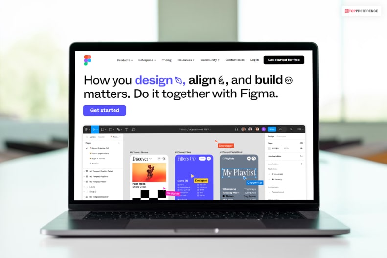
Another popular Piktochart alternative is Figma, the leading User Interface choice. The innovative approach and other powerful features are also tailored and specifically designed for the digital interface of this software in terms of creation.
On the other hand, Figma offers a large range of collaboration and a browser-based platform that streamlines the design procedure from concept to completion. This software tool’s vector-based digital interface ensures the designs are adaptable and scalable. This is also an essential perspective in terms of the responsiveness of website design.
What are the key features of Figma?
- The real-time collaboration feature is extremely awesome for flawless teamwork.
- A comprehensive design set of graphic tools and other elements are extremely supportive.
- The extensive library can easily enhance the software’s functions.
- This software tool has an implementation of other tools and other platforms through which you can easily streamline workflows.
- The responsive design feature is also efficient, which will help you to lay out the graphics creation.
3) Canva

Have you heard about one of the most responsive graphic designing tools? Well, Canva is one of the best options. In this case, this allows you to design the visual appeal in a creative manner without the steep learning curve. This is often associated with even more complicated software. You can use this tool as an email marketing tools in terms of restructuring the content.
This also has an intuitive and user-friendly interface, which makes this stand-alone from other graphic designing tools. This is also accessible for designers. At the same time, this software platform is equipped with a vast range of templates and social media graphics. In this way, this tool makes it versatile for several other projects.
What are the key features of Canva?
- The user-friendly interface is ideal for beginners.
- The drop-and-drag feature is exceptional and performs well in creating easy designs.
- The vast library features are also excellent for managing images, fonts, and icons.
- Online collaboration is also awesome, especially for team projects.
- The mobile app of this software is also an exception for designing creative visuals on the go.
4) Sketch
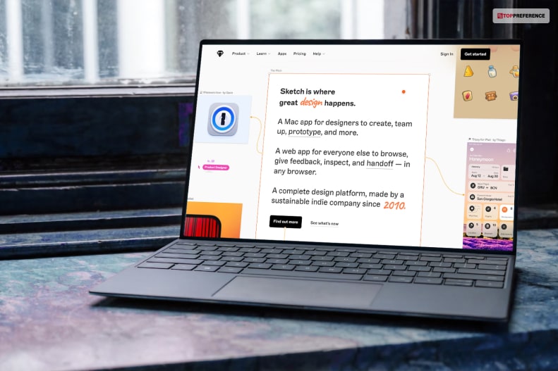
One of the most renowned and famous graphic designing tools is Sketch. On the other side, this also provides a streamlined and intuitive experience that aligns perfectly with the functionality and aesthetics of Mac devices.
On the other side, the sketch also allows scalable and precise designs, an essential feature for the digital interface. This software tool also focuses on efficiency and simplicity, making it particularly appealing to designers who prioritize clean and uncluttered workspaces.
What are the key features of Sketch?
- This gives you an optimized performance along with integration with MacOS.
- The vector-based feature is feasible for scalable and precise graphics.
- The comprehensive plugin ecosystem feature is quite exceptional for extended functionality.
- The large range of collaborative features are also helpful in handling projects and other feedback.
- There are also effortless export options that will help you tailor your web and mobile interfaces.
- Through this software application, you must get regular updates, which will help you to stay aligned with the latest MacOS and other advancements.
5) InDesign

Have you heard about Adobe InDesign? Well, this will help you to redesign the supreme graphics in the domain of desktop publishing, and this offers an unparalleled tool. On the other hand, an extensive range of features will help you create professional layouts and print out the materials.
What are the key features of InDesign?
- The advanced typography feature will also help you to control the detailed text formatting.
- This graphic designing tool integrates with Adobe Creative Cloud for a unified workflow.
- There are also multiple interactive document features, such as animations and hyperlinks.
- The pre-flight and publishing checks are for error-free outputs.
- The wide range of export formats includes ePub and PDF.
6) InKscape

Another open-source platform that rivals several other paid software for handling flexibility and functionality is Inkscape. This is an ideal software, especially for designers on a budget who usually prefer the non-proprietary tool. In this case, Inkscape also offers many features without any associated costs.
What are the key features of Inkscape?
- The robust vector graphic capabilities is mandatory for scalability and precision.
- The compatibility feature is also exceptional for large file formats, including EPS, PDF, and SVG.
- The advanced color management feature is also awesome for handling professional-grade results.
- The active community feature is also feasible for support and regular updates.
7) Affinity Designer
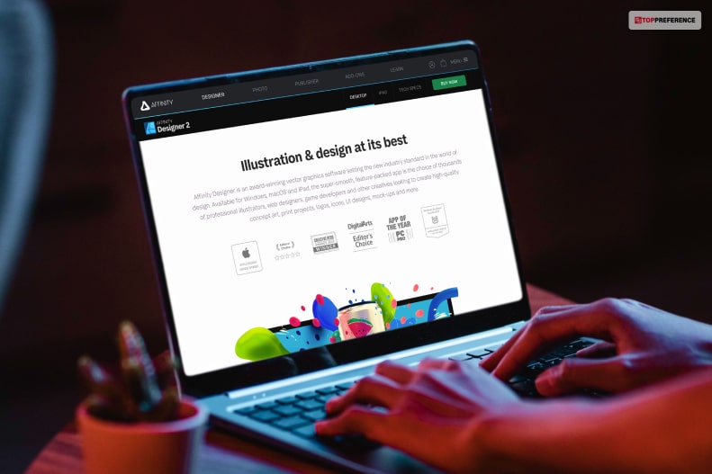
Have you heard about the graphic designing tool and one of the most exceptional alternative tool of Piktochart? In this case, users with high-level functionality and control regarding handling works are Affinity Designers. Other designing tools work, like affinity designer.
It might prioritize breadth over depth, and this also focuses on delivering the depth of several other features that meet the detailed demands of complicated projects.
What are the key features of Affinity Designer?
- Several other high-precision tools have been used, especially for accurate and detailed design works.
- There must be non-destructive toolbars and other panels that help you tailor the workspace to handle individual needs.
- The extensive compatibility feature is also useful in tackling other file formats for versatility and comprehending project requirements.
- This tool is a one-time purchase feature that you will be able to use without any subscription, and this also provides long-term value.
- There is also a seamless implementation with several other Affinity products, especially for cohesive workflow.
In Conclusion
I have already discussed about how transforming boring stats with Piktochart helps above in this article. In this case, Piktochart is a practical graphic design tool offering a diversified range of functionalities to cater to various needs and enhance skill levels. On the other hand, you remember this tool, which is good to handle and gives you the desired outcome.
I hope you find this article. If you have queries, please comment below!
Learn More About: